
Selva Furniture
Responsive Website: Mobile, Tablet & Desktop


Project Overview
Selva is a woman-owned, eco-friendly, ethical trade furniture company specializing in beautifully crafted chairs from renewable sources like bamboo and hemp. The company is in its infancy and looking to break into the market, with its closest competitor being Yellow Leaf Hammocks. Selva sets itself apart by offering sustainably sourced materials and ethical labor practices, unlike its competitors that provide one or the other, making it one of Selva's strongest value propositions.
My services as the visual designer for Selva required me to design web comps for mobile, tablet, and desktop devices that coincided with the mission and vision of the company. The design encompassed user interface design, color scheme and typography, image manipulation and placement, descriptive copywriting, and asset export for development.

My task was to design a responsive website inspired by the company's logo and mission of sustainable and ethical trade. I delivered mobile, tablet, and desktop design comps, along with exported assets for the web developer to work from to ensure the look and feel of the site resonated with the company's brand.
Project Scope


My role as the visual designer was to work with the company CEO and Founder, Yolanda Lopez, to design the look and feel of the Selva Furniture website.
My Role
Problem & Goal
As a fledgling startup with a limited selection of products, it was imperative to design the website with an emphasis on the craftsmanship and the manufacturing process of the furniture to encourage the right audience to pre-order the first few designs, enabling further manufacturing with the revenue from initial sales.
Design Process
The process for this project began with a discussion about the goals and mission of the Selva Furniture company with its owner, Yolanda Lopez. I wanted as much information as possible to help guide my choices in achieving the website's objective. Once I was clear about the direction, I started creating some initial paper wireframe sketches to get a general layout for the site.
Wireframe Sketches
Mobile

Tablet

Desktop

*The paper sketches serve as preliminary
layouts that become more refined with
digital iterations as you see below.
Low Fidelity Digital Wireframes
Next, I scanned my sketches into my computer and placed them into Adobe XD to begin the low-fidelity digital wireframes. Blocking in the basic layout, I knew how many images I had to work with, giving me a good blueprint from which to work. I started with the mobile device first and then worked my way up to the tablet and desktop versions of the site, making adjustments to the image grids for each one and reevaluating the scale and placement of the surrounding elements on the page. I also had to scale and adjust the navigation bar and main tagline from device to device to ensure the legibility of the text and achieve a balanced design.


High Fidelity Digital Wireframes
After making some adjustments to the low-fidelity wireframes, I moved on to the high-fidelity wireframes adding in the copy and other text to get a general sense of scale for the differing elements. At that point, I started to consider the typography I would use and the color palette that best conveyed the mood and look of the site. Often the images I'm given to work with will also contribute to my choices about the direction of a design. In the case of Selva, the images evoked an earthy, casual yet upscale feel which affected my choice of typography and color.


I decided to go with the Mostra Nuova font for the name of the company and all the headings on the site because of its sleek contemporary feel that reminded me of cane bamboo. I paired it with the Astoria font for navigation and heavy text areas for its organic quality and legibility.
Typography
Type-scale for: Selva Furniture

60pt
36pt
28pt
18pt
Color
The color choices came from images of the chairs and nature scenes. I wanted to bring a rich sense of earthiness balanced with an airiness to the site to keep it casual yet elegant. I went with a deep rich green of a jungle and some soft taupes that look like clays or sand, and I used charcoal gray for the text for legibility and softness. I felt a black would be a bit too harsh of a contrast. All the elements needed to work cohesively for the design to be successful.


#3B552D
#C3B4AA
#585858
#D5D09C
Digital Comps
When I felt happy with the layout, the typography, and the color choices, I moved on to the digital comps, bringing everything together for the final design layout to share with the owner and get the go-ahead for batching and exporting the design to the developer.


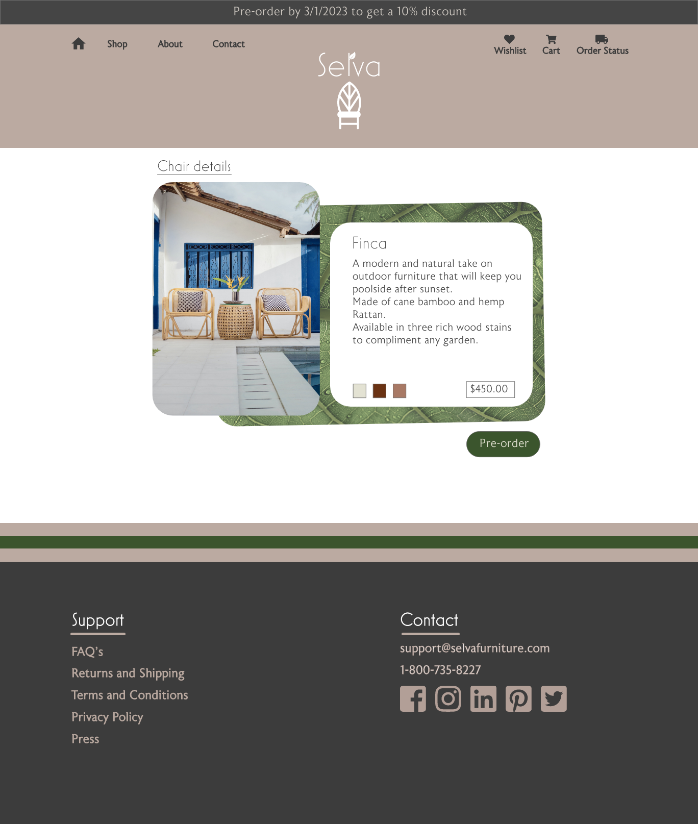


Final Design

Challenges & Take Aways
The biggest challenge in creating the Selva website was figuring out the best way to convey the company's mission, engage the audience, and encourage them to pre-order Yolanda's designs. I knew we had to build a sense of trustworthiness and transparency for the company because it lacked history. People had never heard of it. We had to answer the question, "why?" Why should consumers buy her chairs instead of those of her competitors? I solved this problem by prominently and intentionally telling the company's story and showcasing the values and materials used in manufacturing Yolanda's designs. Her artistry spoke for itself in the beautiful images of her chairs. They just needed the proper staging to make them pop.
The Selva website was a fun challenge because it was a new business and a clean canvas on which to work. I mainly had free reign on the design decisions, which made it exciting. I share the same values as Yolanda, so I wanted to make her site unique, not just an ordinary, run-of-the-mill furniture site. It was important to show both the beauty and ethics of her designs from nature and why we, as consumers, can make better purchasing decisions to help ourselves and the planet. I accomplished this by answering the "why" and giving Yolanda's designs a spotlight to outshine her competitors.